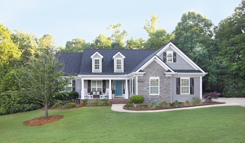
Project Curb Appeal at the Forest House is finally complete! Whew! Over the past 15 months, we have transformed what was once boring, builder’s-grade, and mismatched into a clean, modern, and customized charmer. Here are loads of pics to show the transformation!
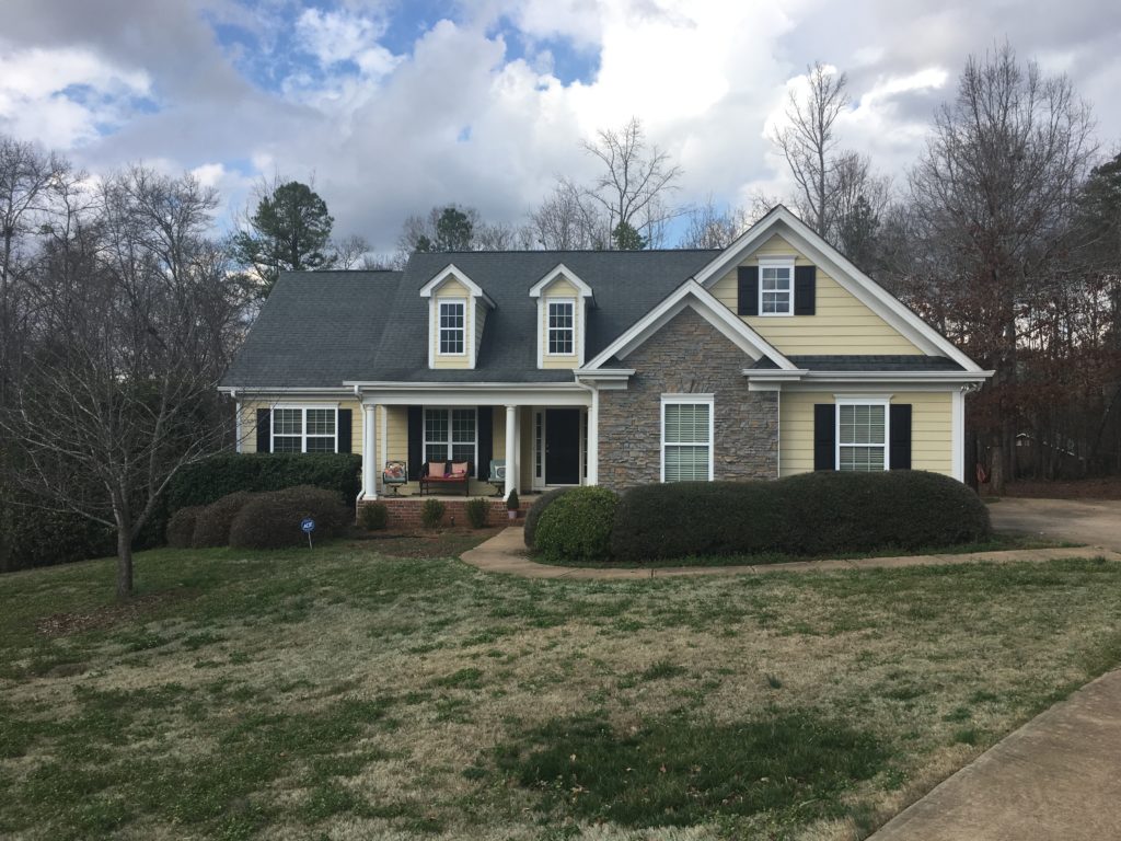
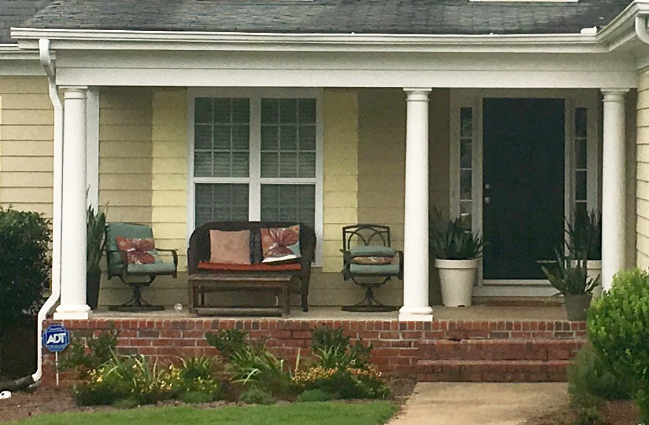
At purchase, the Forest House was very…yellow…and sad. And it needed way more than a simple coat of paint to make it shine. From the overgrown builder-installed shrubs, to the plastic shutters, to the mismatched style (colonial columns on a contemporary home – what the what?), to the discolored roof, the overall design style was, shall we say, lacking. So, we set out to completely update the curb appeal of our Forest House.
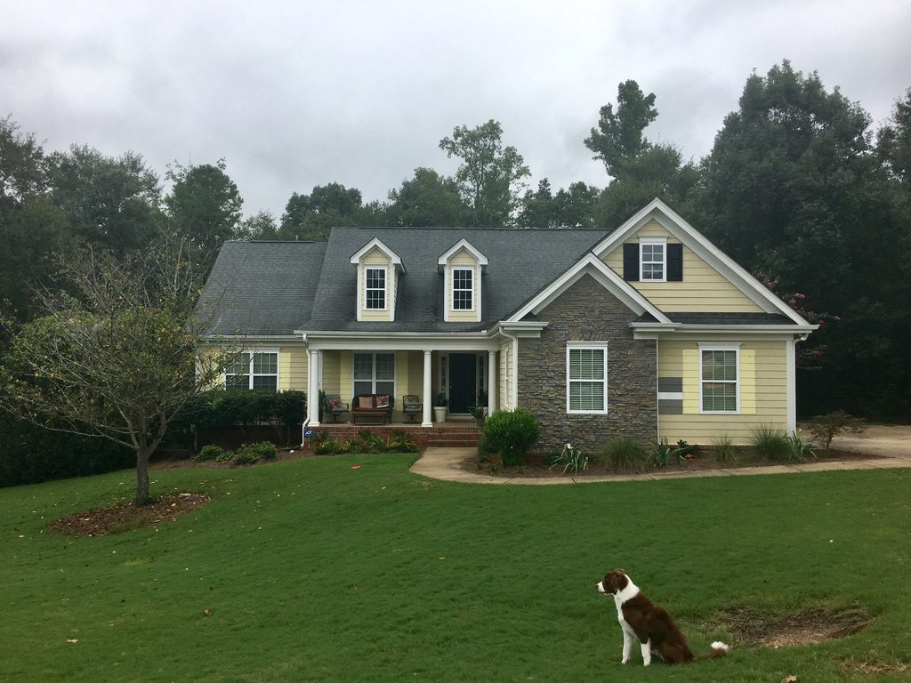
Before: Zero Curb Appeal
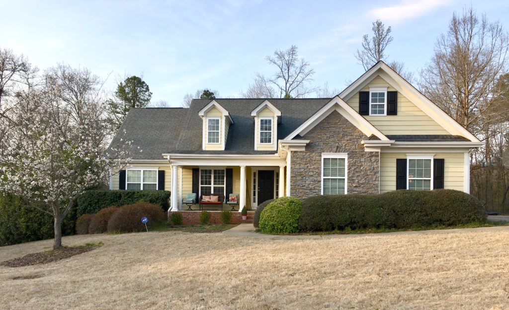
Here’s a look at the Forest House when we started Project Curb Appeal. Some adjectives I might use to describe this picture include: sad, basic, yellow, shabby, and….unkempt. Feel free to add your own!
Accomplished to date:
- Overgrown, builder-grade landscaping removed, rethought, and replanted
- Entire exterior painted (bye bye yucky yellow)
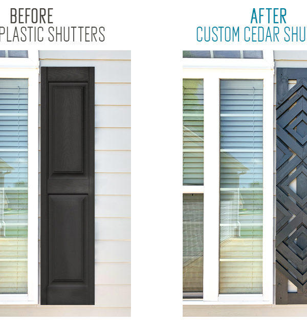
- Plastic shutters replaced with our DIY custom cedar shutters
- Odd columns knocked out and replaced with DIY craftsmen-style pillars
- Sad and tired roof replaced with new architectural shingles
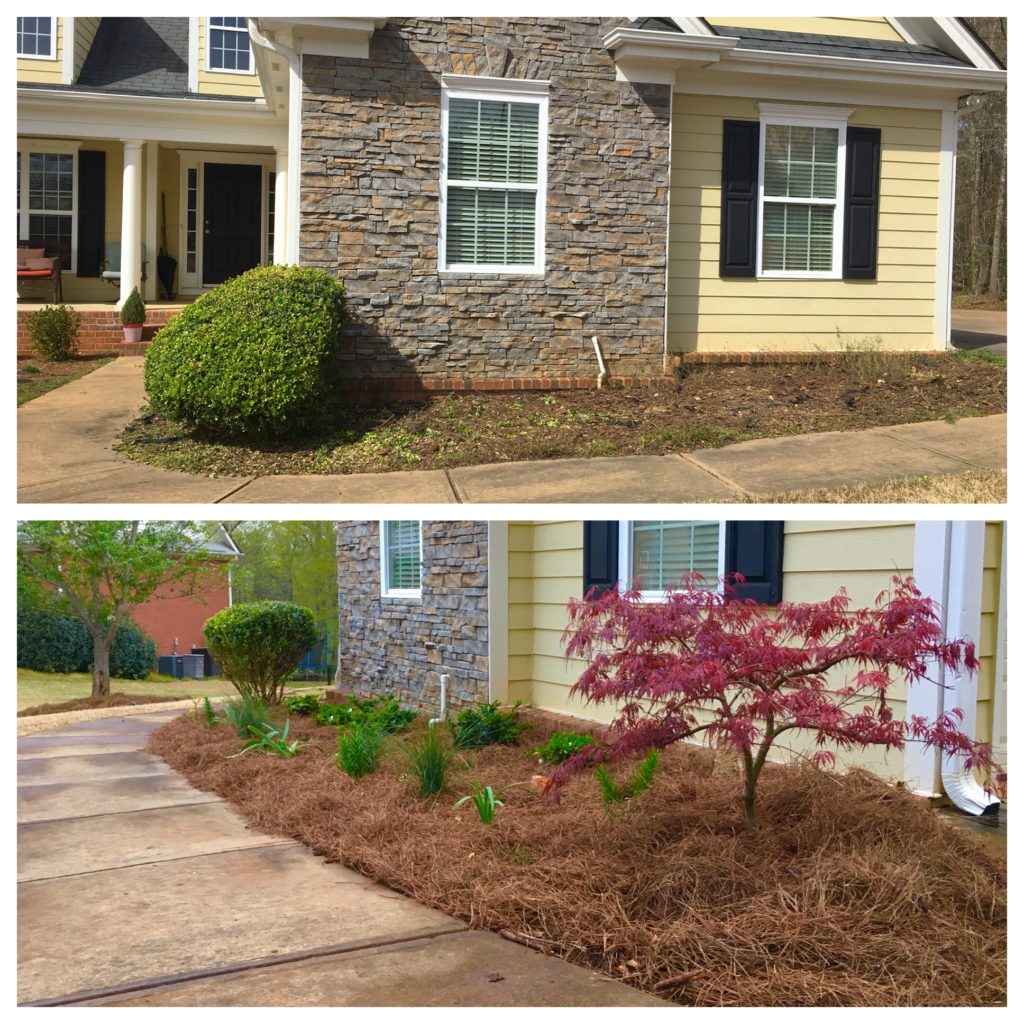
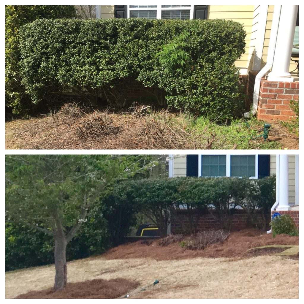
Landscape Refresh: Removing the Builder-Grade Plants
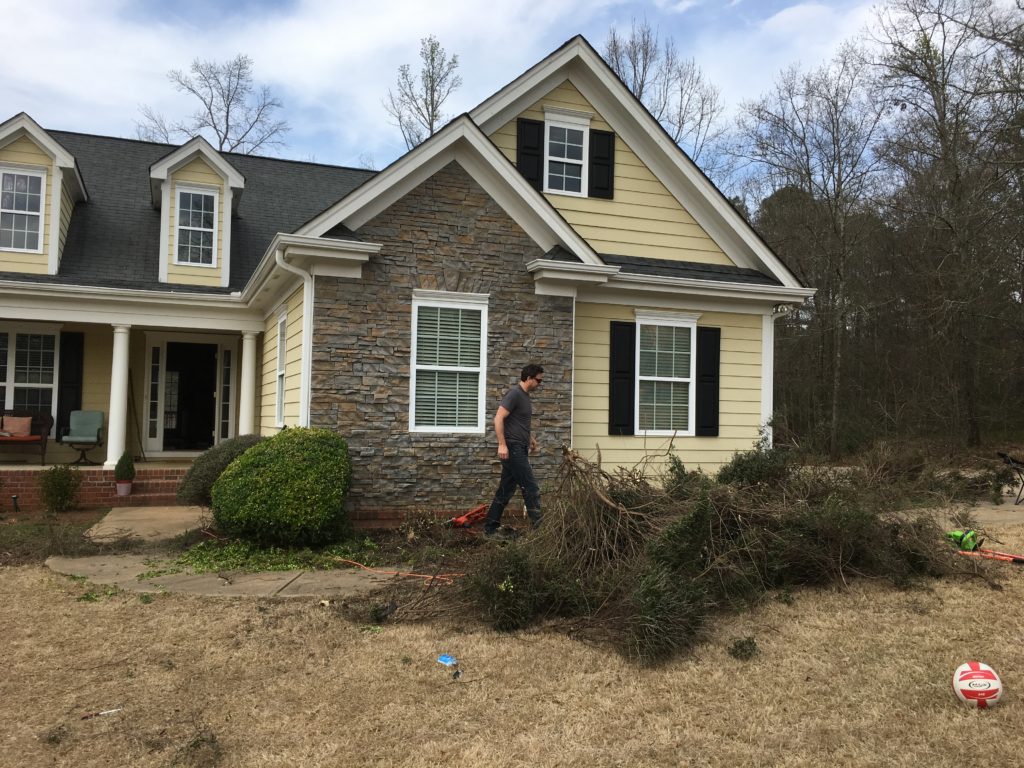
The overgrown shrubs had merged into one giant uni-shrub! Haha. You know, like a uni-brow, but in shrub form. (P.S. Chris asked me to draw googly eyes below the unibrow/unishrub to illustrate my point, but I resisted. LOL)
We tore them all out, leaving only a couple of anchor plants behind. This image shows the brutal aftermath after we broke out the chainsaw.
Here are some before and afters of the front beds.
Paint Refresh: Painting Away the Yellow
Lemme start by saying, we don’t hate yellow. We painted our daughter’s nursery a cheery yellow before she was born. However, the yellow on the Forest House wasn’t cheery, it was drab and screaming for a modern facelift.
We pulled off the plastic shutters (more on that below) and left them on the curb for the recycling truck. On the garage window (bottom right), you can see the hardiboard siding underneath and it’s almost the same yellow as the house. Like, the builders could have just left the raw siding color and moved right along!
Once you start demo on a project like this, there’s no turning back. We couldn’t leave the house in this condition for long. It was time to pick paint colors and quickly get to work.
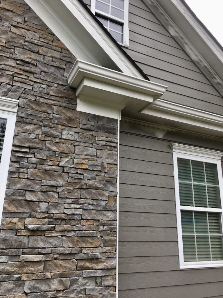
For the main house color, we searched many shades of neutral gray and greige (gray/beige). Grays are hard y’all. They are sometimes too yellow, too red, or too blue. Combine that with trying to complement the house’s grayish-yellow stacked stone and the reddish-brownish-organish brick skirt, and it was tricky.

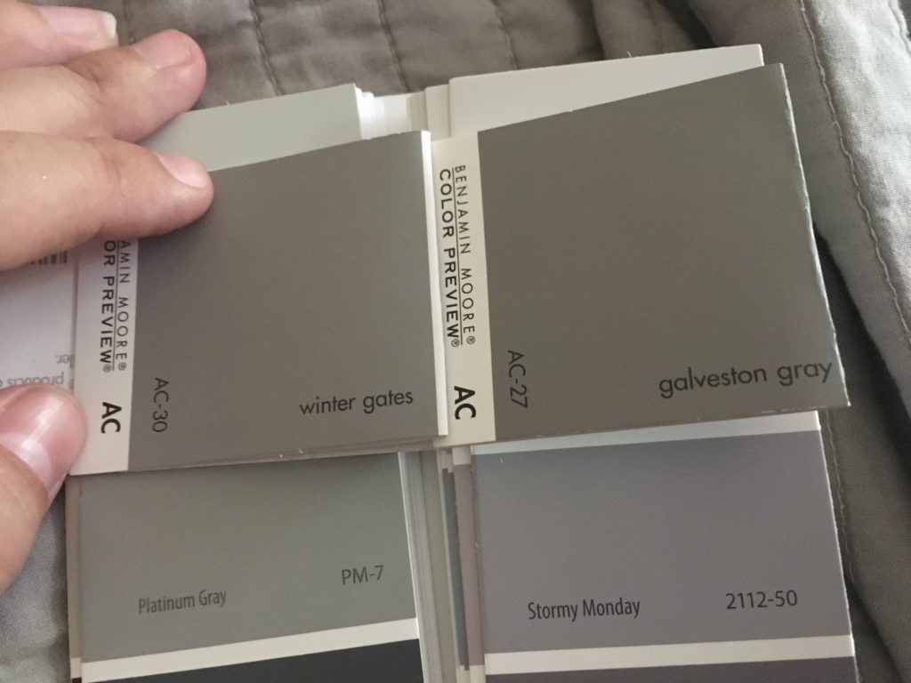
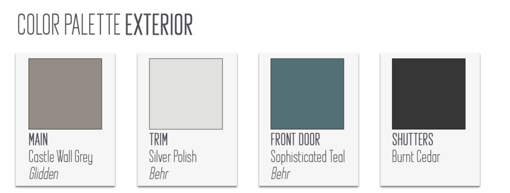
After MUCh trial and error, and tons of samples, our favorites were Winter Gates (Benjamin Moore), Galveston Gray (Benjamin Moore), Elephant Skin (Behr), and Castle Wall Grey (Glidden). We tried progressively larger samples on the house as we narrowed it down and picked the house color winner: Castle Wall Grey!
Trim will be Silver Polish and the front door will be Sophisticated Teal. Even though Castle Wall Grey is a Glidden color, we got everything mixed using Behr paint.
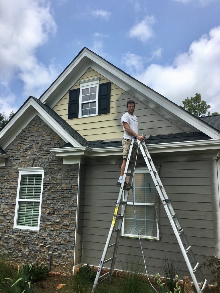
Once we finally determined the paint colors, Chris could start painting the body of the house with our trusty paint sprayer (#14 on our Must-Have list!). This part of the process goes fairly quickly and the look of the house changes with each pass of the spray-gun.
We covered the windows with plastic and actively worked to prevent overspray from hitting the roof and the brick/stone. We didn’t worry about hitting the trim, since we came back with rollers and brushes to do the trim later.
So, I have a confession. I made Chris get in the 40 ft tall boom to paint the tallest side of the house. In my defense, I don’t “DO” heights. I once got stuck on the roof of the Palms House for almost an hour…just clinging to the chimney with my heart racing. Chris thought we were going to need to call in the fire department! Haha! No lie! So, for everyone’s sake, we leave anything that requires climbing (higher than a short ladder) to Chris.
Even so, Chris was less than thrilled using the 40 foot boom lift on the side of the house, but he’s a trouper!
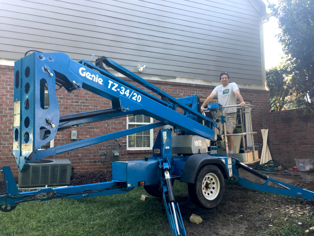
Here’s a fun clip of Chris maneuvering (and me laughing nervously) while he tries to use a 40 foot tall boom! I say “fun” because I was safely on the ground. Haha!
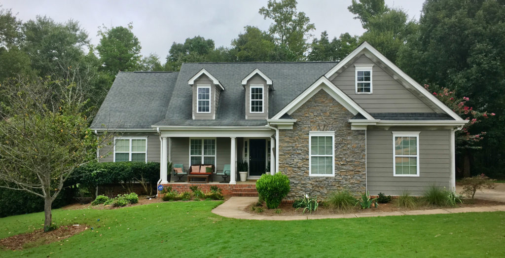
Here’s another look at the house color….before the trim was finished.
Shutter Refresh: Ditching the Plastic Shutters for Cedar
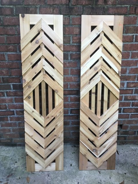
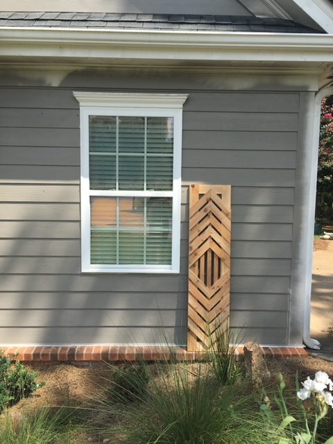
To up the curb appeal, we ditched the drab, everyone has them, plastic shutters and created our own inexpensive, modern cedar ones!
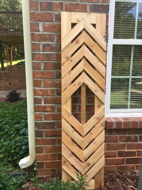
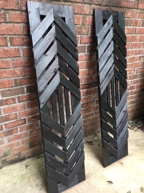
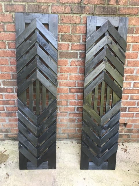
We’ve posted about the cedar shutters we built for our neighbors, but we also built them for our own home too. After several sketches, we came up with a simple, but interesting shutter design to enhance the curb appeal.
We used cedar, but instead of painting or staining them, we burnt the wood using a blowtorch. This method is called Shou Sugi Ban and originated in 18th century Japan. Once the outside layer of wood is slightly burned, bacteria and fungi are prevented from damaging the wood. Bonus: If you add some of these to your home, you’ll likely be the only house on the block/city/county to have them!
These are super simple to make and all the arrows are 45 degree cuts. If you follow this tutorial to create the frame, you can add angled pieces very easily.
Column Refresh: Stylistically-Appropriate Columns
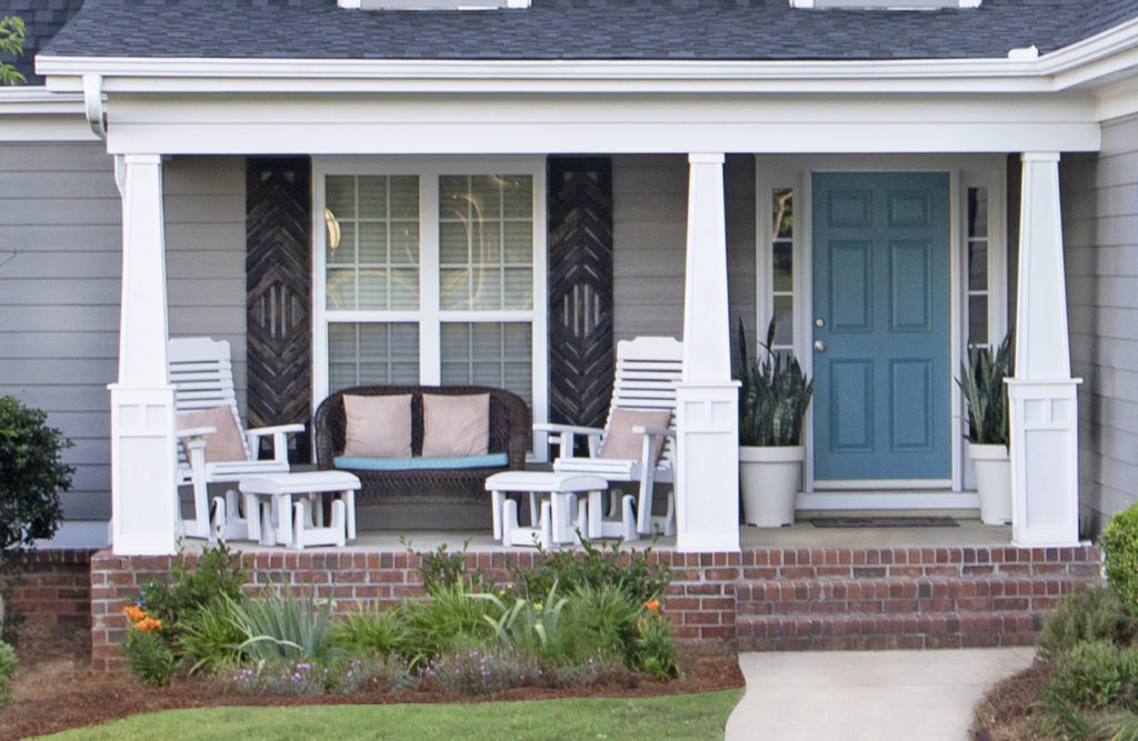
The columns on the front porch were odd. Their round shapes were more suited to a colonial home than a contemporary craftman-esque style. So….we knocked them out and built new ones!
The new squared, tapered columns really upped the curb appeal. They are clean, simple and draw heavily from craftman architecture.
We re-routed the downspout (left side) so it wasn’t attached to the column. (Why would anyone do that in the first place?!).
Roof Refresh: New and Improved Roof
The very last step in Project Curb Appeal was the installation of a new roof. This was also the only step we didn’t do ourselves. Let us not forget my irrational fear of heights!
The shingles on the original roof had two strikes against them. They were recalled for failing prematurely and were damaged from a wind storm. New shingles to the rescue!
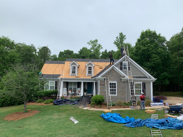
We chose a deep charcoal gray (Certainteed Landmark Premium in Max Def Moire Black) that complimented the earthy tones and grays in the stone and shutters.
Before & After
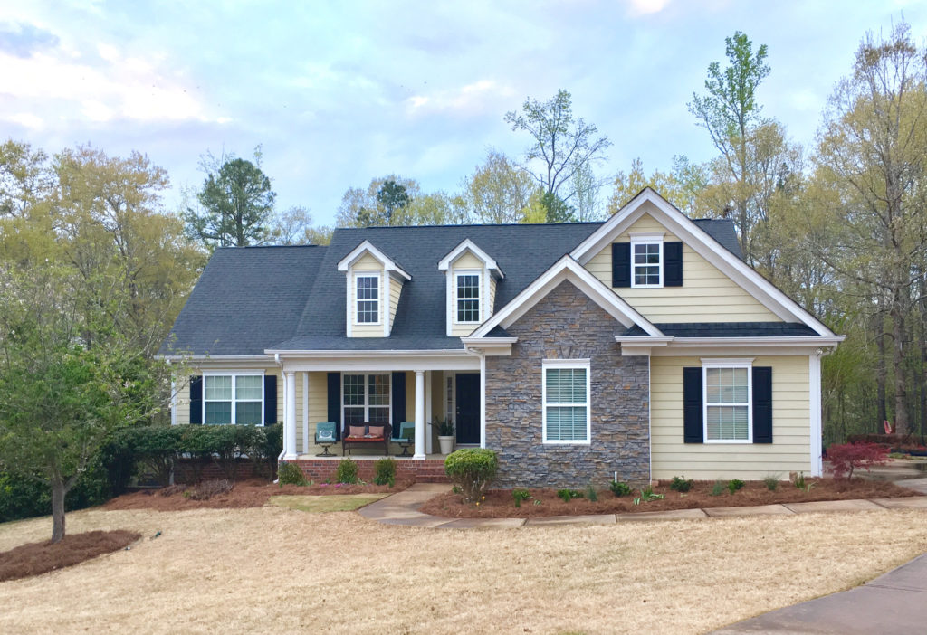
One last look to save you some scrolling! Before we began our curb appeal improvement project for the Forest House….
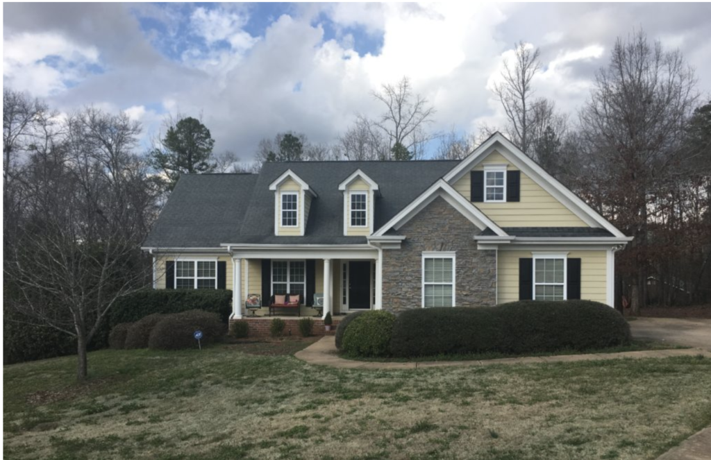
…and After the curb appeal refresh!

We are really pleased with the improvements and the new curb appeal. Loving the updated look of our home! Now on to the backyard and gardens!
If you found this post useful and inspiring, save THIS PIN to your Exterior Renovation board on Pinterest.

I’m curious to know, but unfortunately did not see in your description of the project, what kind of siding this house had. Was it wood or vinyl? We have a white vinyl sided ranch with red brick on some parts and grey cinder block skirt. Would LOVE to update with a faux stacked stone over the brick (the brick parts are well protected from the weather), and to jupdate the siding color, but since the siding is in good shape really didn’t want to incur the expense of residing. But can vinyl effectively be painted (and last? NOT interested in having to repaint every other year)…The color scheme you used here is very classic…