We purchased the mid-century house because it’s on a wonderful piece of property, which is situated in a great little city, and it has GREAT bones. These facts allowed us to look past the hodgepodge layout in the kitchen (which was a true challenge). We knew we could modernize and make it more functional and much prettier. In this post, we’ll give you the skinny on how we are gutting our 1950’s kitchen in order to unleash it’s full, beautiful potential!
If you missed the video tour of the house pre-renovation, check out the post here: Our Revealing Mid-Century House Video Tour!
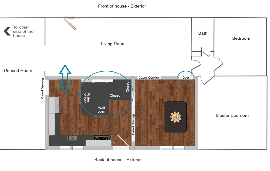
Kitchen ‘Before’ + Old Floorplan
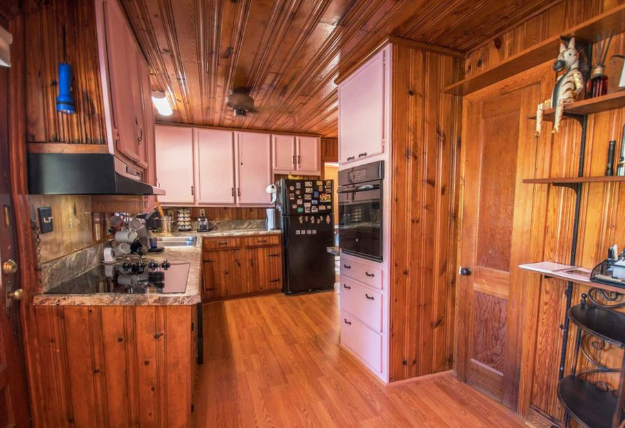
Eek. Here’s what our circa 1952 kitchen looked like on inspection day. I feel like a sad trombone ‘womp womp’ is in order. It was tidy, but also had PINK cabinets, crackling laminate wood-look floors, lots of tongue and groove pine planks on the walls and ceiling, and an overall dark and cramped vibe.
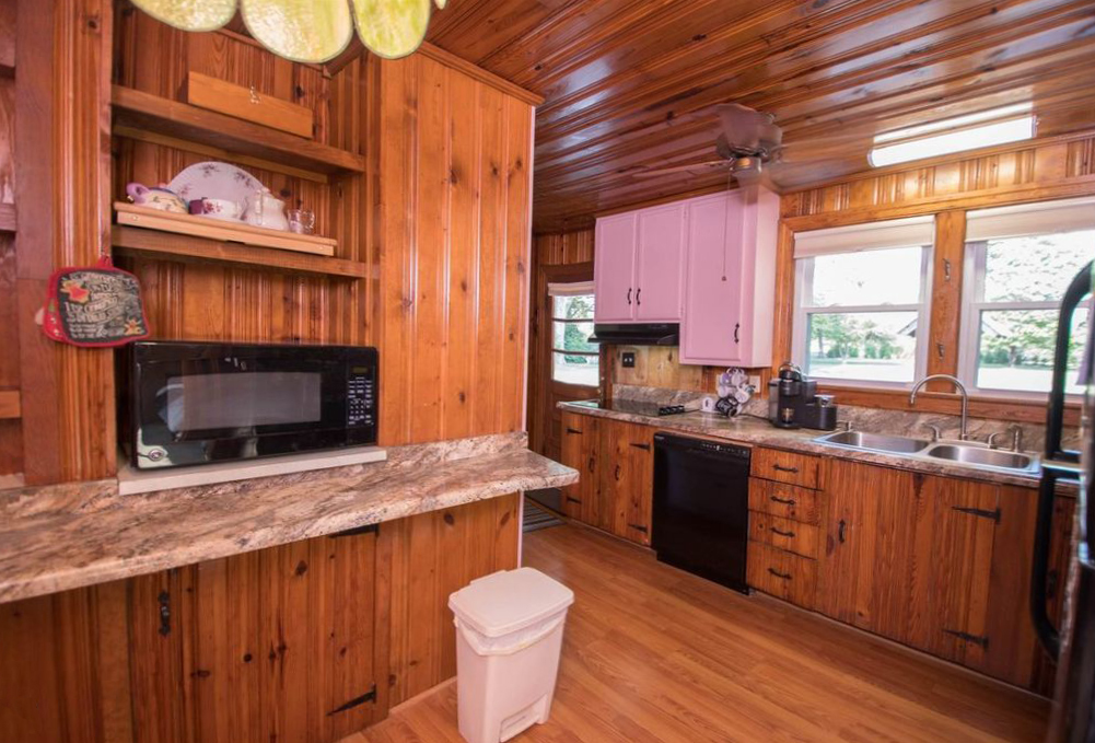
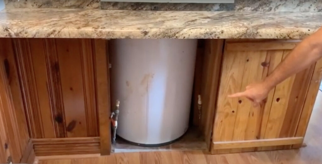
There was a large ‘bump out’ built to enclose a hot water heater, but it really disrupted the flow and functionality of the entire space.
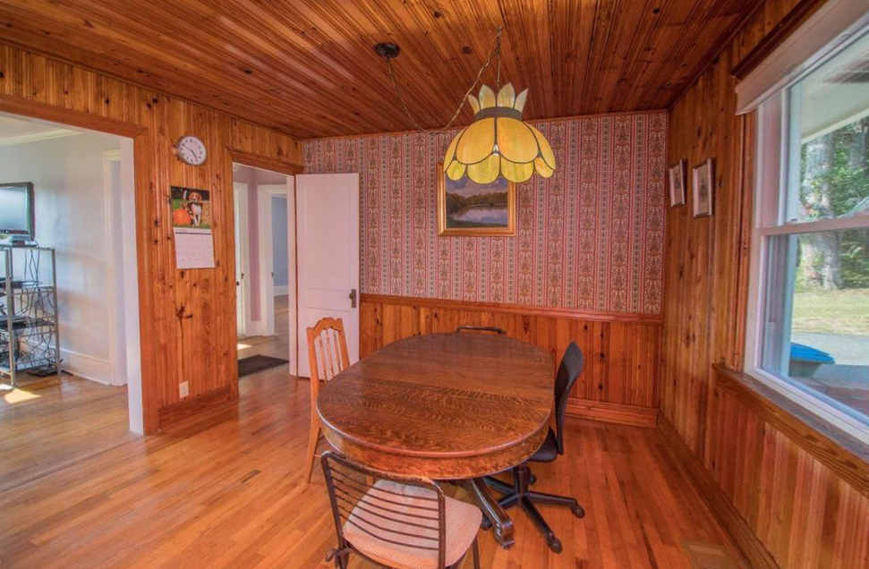
The dining room (more like an eat-in kitchen) needed some love too. The design was a tad dated and made the room feel dark, even with the large windows. There was also an extra door out to the hallway in the corner that decreased usable wall space.
So, our renovation plans for gutting our 1950’s kitchen included:
- Brightening the dark ceilings and walls
- Overhauling the cabinets and countertops
- Improving the workflow issues caused by appliance placement
- Moving or hiding the electrical panel and water heater
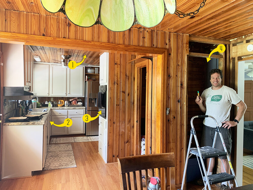
Here’s the “before” floorplan with the areas of concern indicated.
Inspiration and New Floorplan
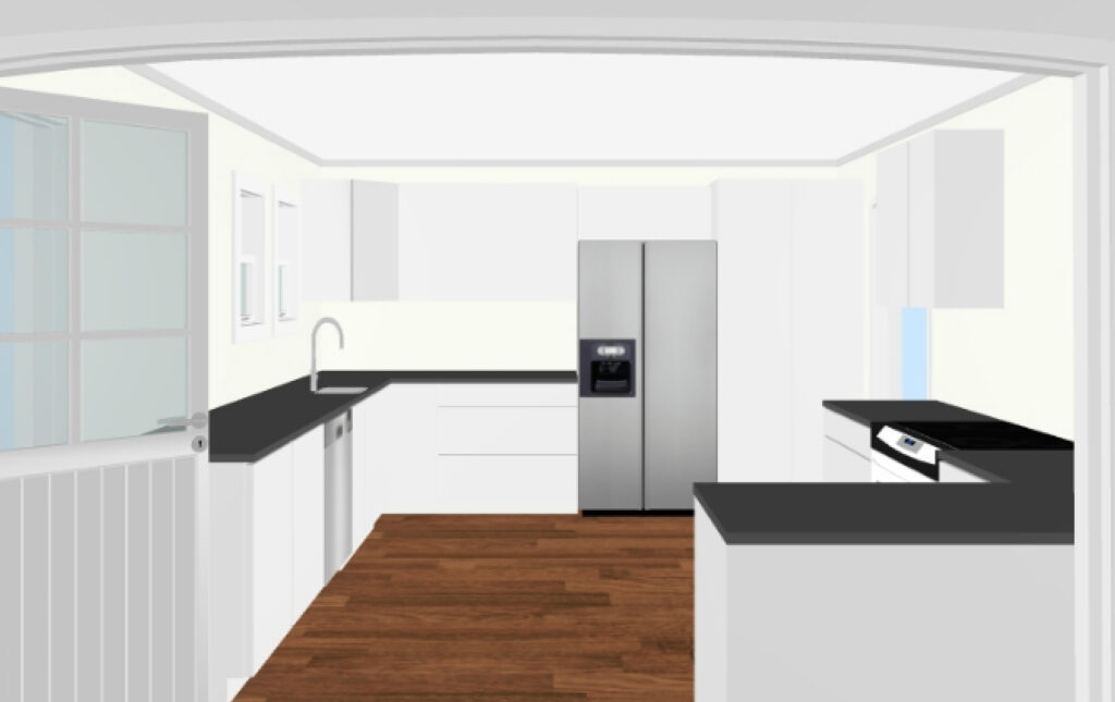
After a lot of sketching out floorplans and searching Pinterest, I found a few kitchens that served as inspiration. The design below, although more modern than our home’s feel, was a great starting point. We loved the light counters, the idea of an island or peninsula to improve flow, and especially appreciated the natural light throughout.
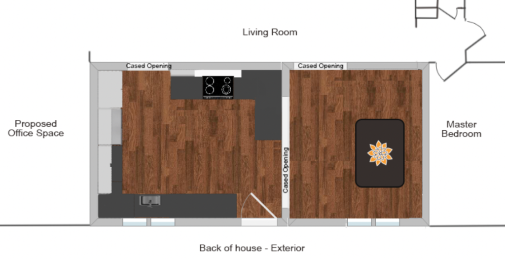
I created a layout based on our dimensions, closing off an existing cased opening in the kitchen, closing a doorway off in the dining area, adding a new cased opening out to the living room, and improving the working triangle of appliances and prep space.
Here’s a quick mockup of how this might impact the floorplan too.
Gutting Phase 1: Demoing the Bump Out
Deconstructing and gutting our 1950’s kitchen was a fairly tedious process. We had to take our time, make sure the walls weren’t load-bearing, and remove about a million heavy nails. But as the saying goes, the best way to eat an elephant is one bite at a time!
So here’s Chris again with the before image for comparison.
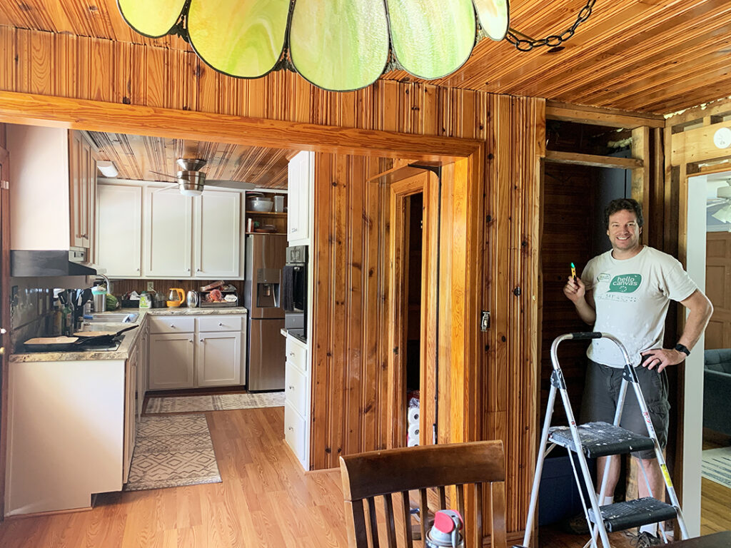
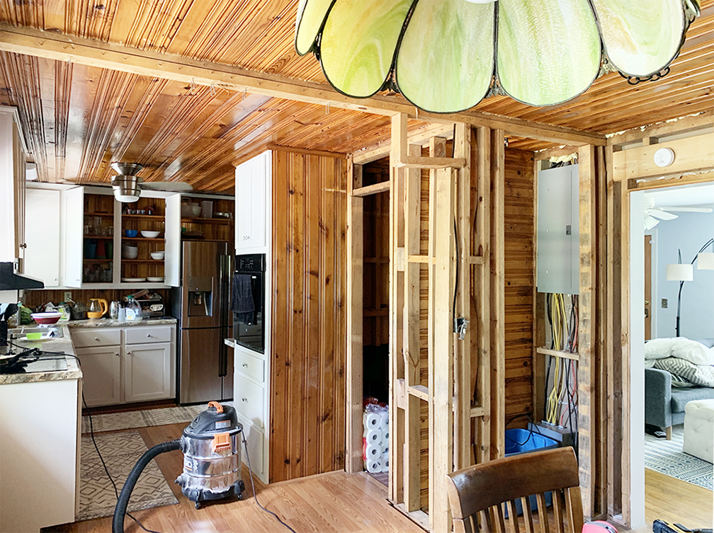
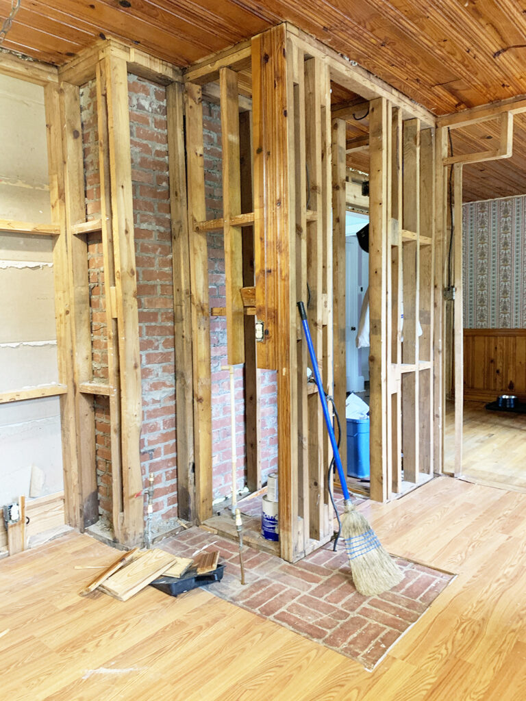
Then, we began by removing the heavy, cased opening and demoing the two small closets/pantries.
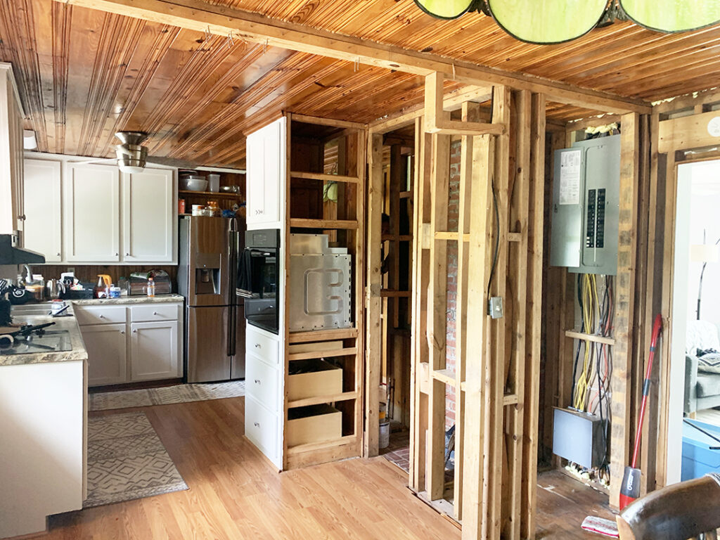
Next, we started disassembling the wall oven unit jutting out into the middle of the kitchen.
With the wall oven gone, we could finally see from one side of the kitchen to the other! Small wins y’all!
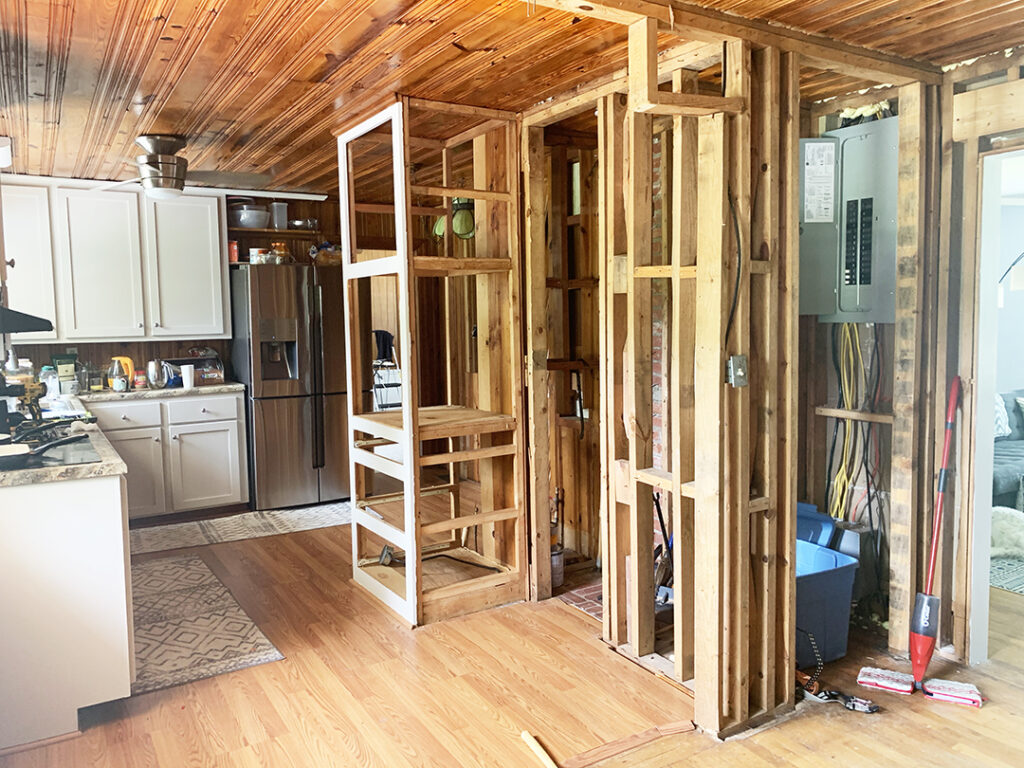
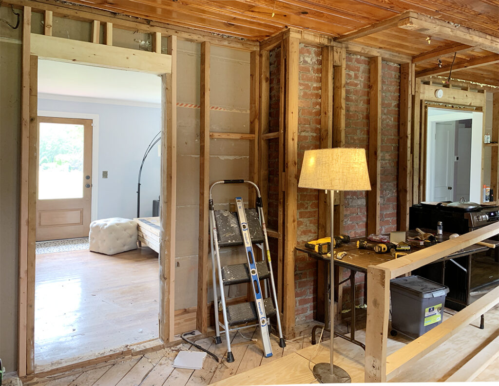
After we totally removed the structure holding the wall oven, we started removing the framing in front of the brick. Yes….brick!
This was actually a very pleasant surprise. We knew the back of the chimney would be behind the walls, but we didn’t anticipate the brick and mortar would be so well-done. The craftsmanship was perfect. It was almost like it was meant to be exposed!! So, we modified the plan to include exposed brick in the kitchen!
Gutting Phase 2: Relocating Openings
My vision was to enclose the current opening that led from the refrigerator to the adjacent room, add a pantry in its place, and open a new cased opening to allow access to the living room area. That way, when you walked in the front door, you would be able to see the kitchen and straight through to the back yard.
Here’s my very crude drawing of what this might look like!
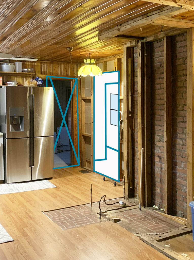
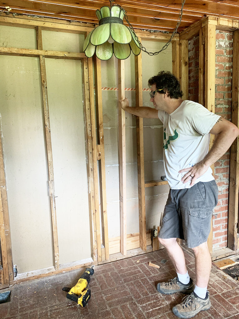
But great minds think alike and when we removed the paneling from the wall, we realized that there HAD been an opening there at some point in the past 70 years.
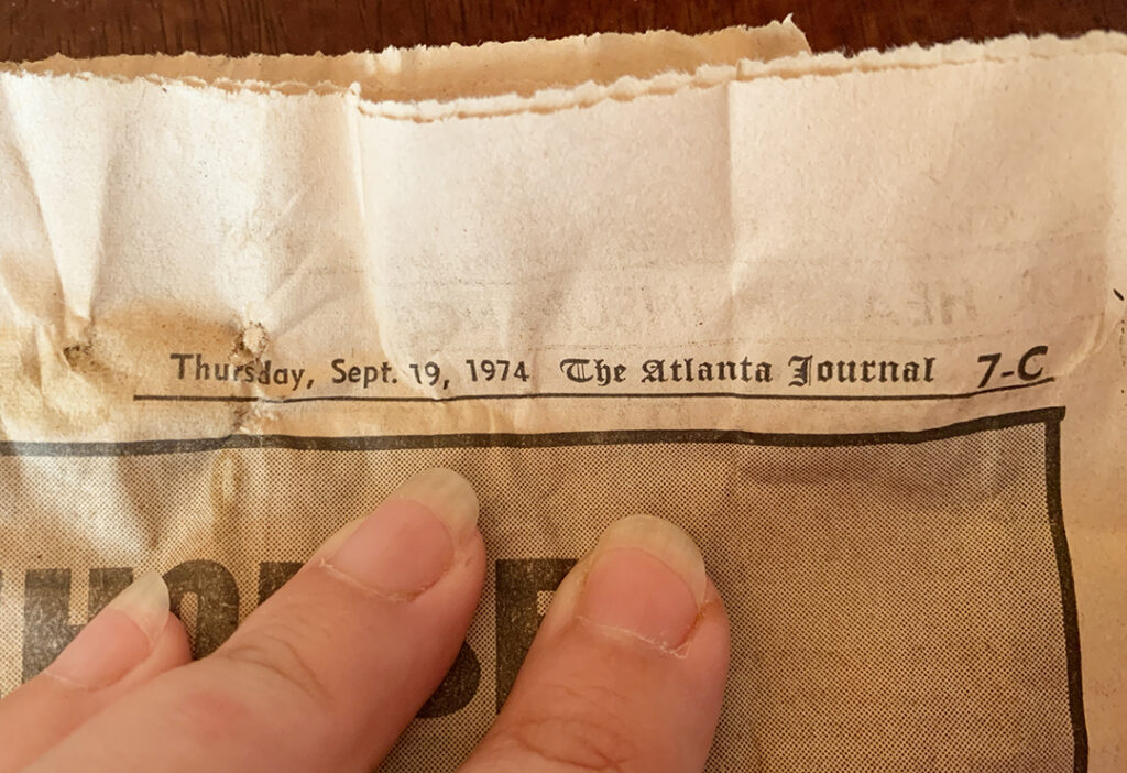
We found a newspaper in the wall void dated to the early 1970’s – so, we guess that might have been when the layout was changed.
Chris and I put up temporary support, blocked in a new header, and cut out the drywall with the handy Sawzall!
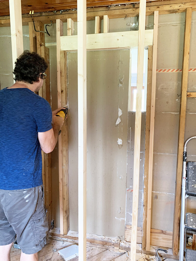
Here’s a SUPER quick video of JoJo pushing the new cut out wall to the floor. We have a new opening!
With the new opening, the bump-out removed, and the beautiful brick chimney exposed, we are DONE with the major demo.
Now, we get to build it all back again.
We hope you enjoyed this quick progress post on how we’re gutting our 1950’s kitchen! In coming posts, we’ll share our many, many flooring dilemmas, how we tackled the oddly placed water heater and electrical panel (not at the same time though lol), and our design selections for the finished space.



Sooo does Chris need to come up to move the panel?
Love the brick👍
Chris is our go-to electrician! You know he’s involved on this project for us! 🙂