We are unbelievably excited to have the kitchen in the Midcentury House completed! As anyone who’s done a kitchen reno knows, it’s a tough one to live through. This project took us several months from start to finish (or as we call it: demo to reveal), but in the end, this tremendous kitchen transformation was budget-friendly and made an incredibly positive impact on the heart of our home.
Livable Luxe
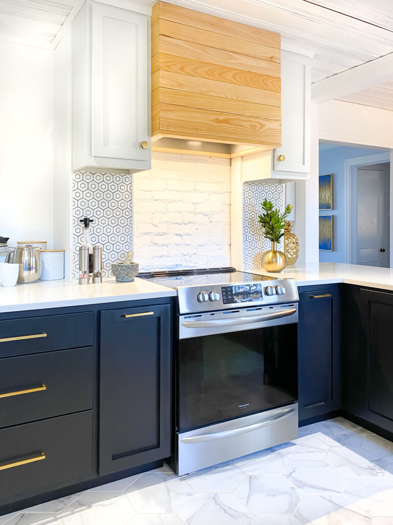
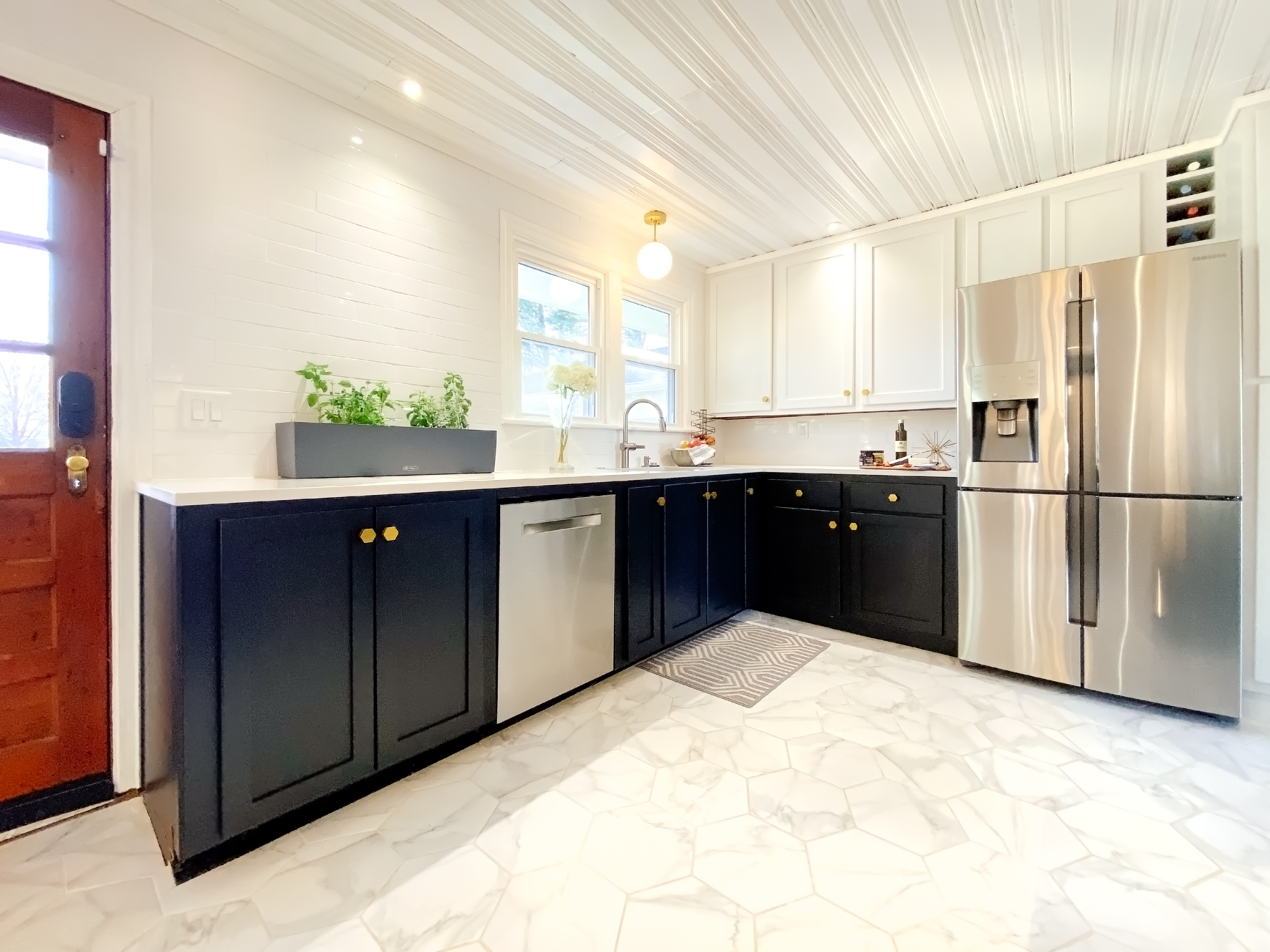
We like to think of the overall design of our kitchen as livable with a touch of luxury. Livable because we are real people who spend a LOT of time in our kitchen. But it also feels a tad luxurious, mostly in the touches of gold, moody color palette, and beautiful quartz countertops.
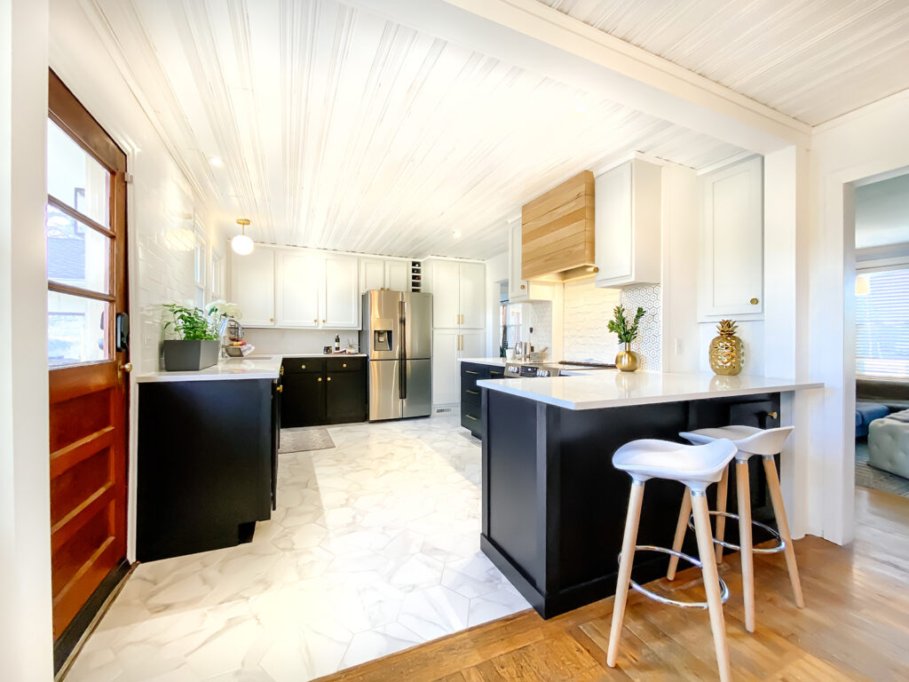
Some of the most striking visual elements in the new kitchen are the satin black cabinets. We tested different about 10 shades of gray, charcoal, and black before selecting Sherwin Williams’s gorgeous Tricorn Black cabinet paint for the lowers. To complement this deep, rich black, we chose Sherwin Williams’s soft gray Nebulous White cabinet paint for the uppers and the pantry.
The quartz countertops, which shows as a creamy gray with hints of white veining, are in the color Whistler from Allen+Roth.
FYI — We’ve included full details on all the colors, materials, and finishes further down in this post!
The rest of the room feels light and airy, thanks to the white wood ceilings, white trim, white tile backsplash selections, light hexagon tile flooring, and bright counters.
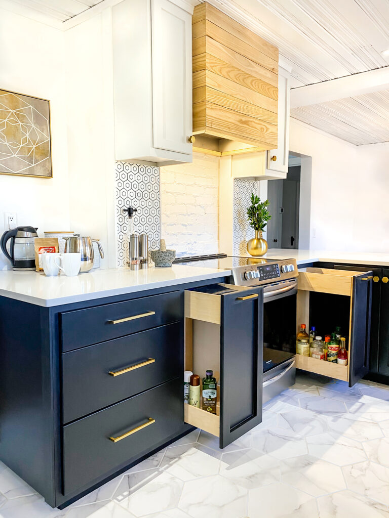
Space is a prized commodity in any kitchen, so we made the best use of our footprint. After a shopping trip to a kitchen showroom had us drooling over all the fancy extras (HELLO soft-close range pullout cabinets), we decided to just build them ourselves and save hundreds of dollars.
I drew up the plans and Chris brought them to life! The top section of the range pullout cabinets hold our spatulas and knives and the bottom section organizes our oils, sprays, and sauces. (Stay tuned because we’re putting together a full post on the construction of these cabinet pullouts!) We also built huge drawers to organize our pots and pans.
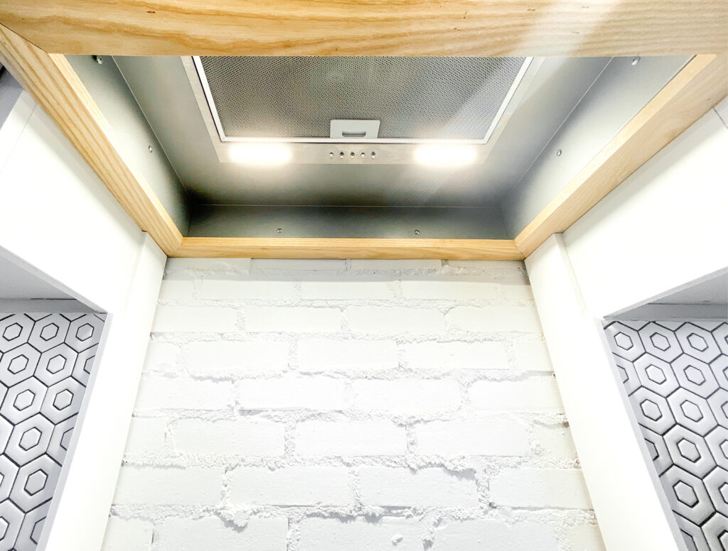
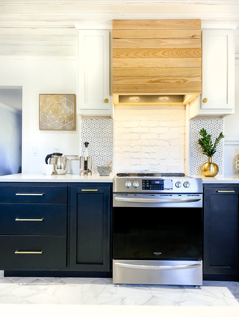
Another design feature we love is our custom reclaimed wood hood vent. The wood, which we purchased from an amazing local sawmill, is reclaimed Ash that we cut to fit around a Braun stainless steel range hood vent. We framed the Braun hood vent with the matching Braun box hood liner. Then, underneath, we used trim we cut from the reclaimed Ash, so everything looks seamless.
From this view, you can also see our exposed brick wall! It’s the back of the fireplace and was in perfect condition when we removed the wall, so we painted and kept it as a design feature.
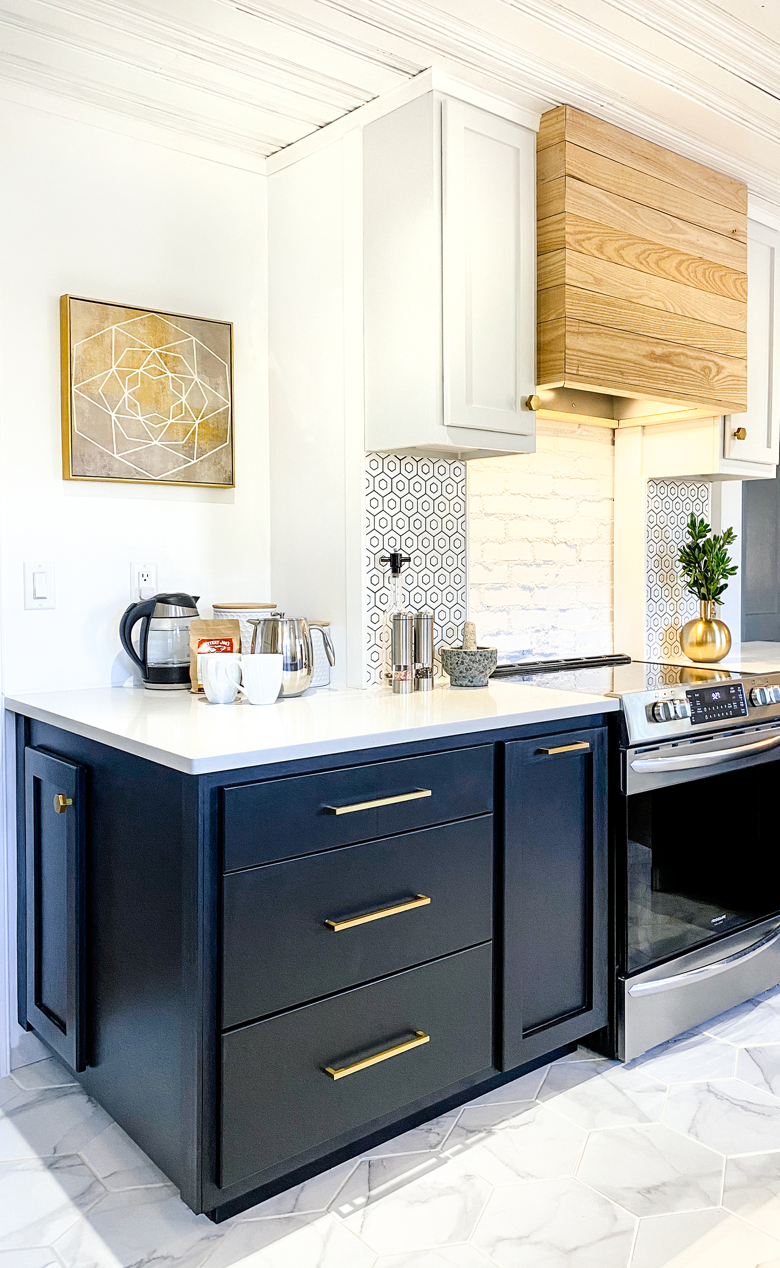
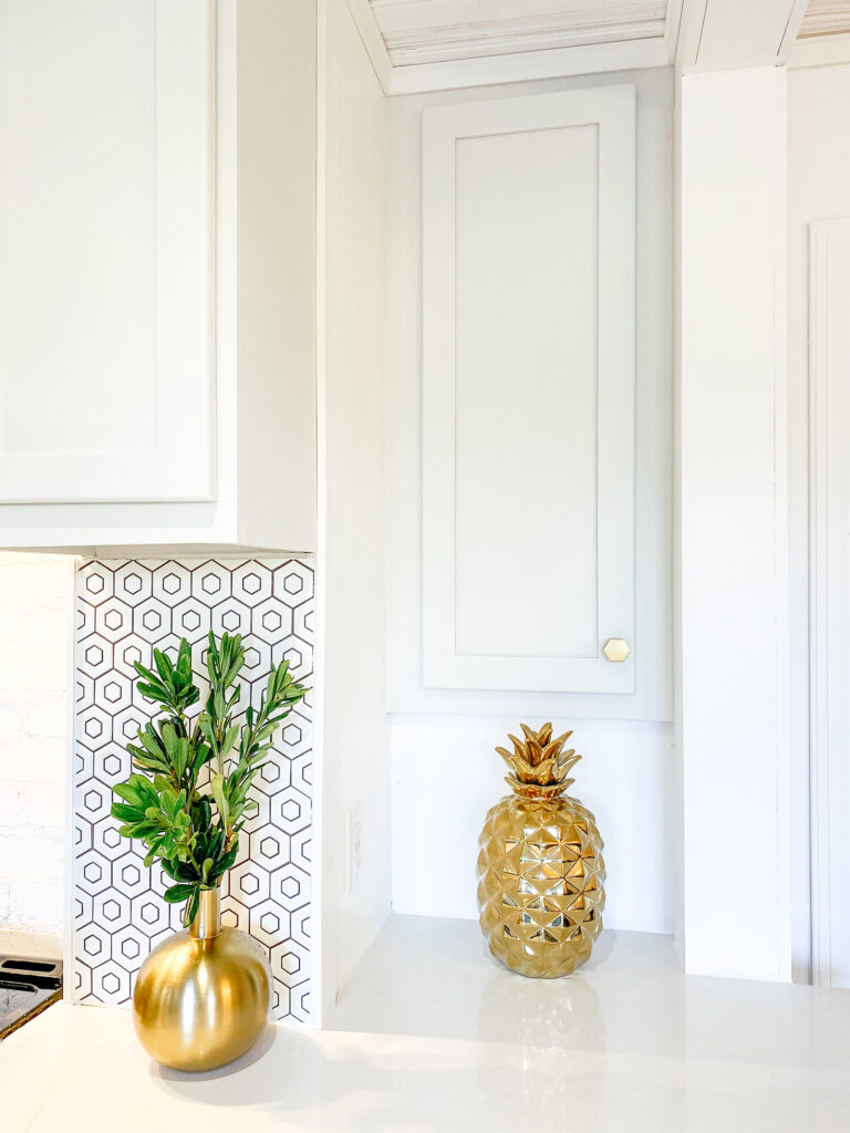
On either side of the range is another touch of hexagon in the room with the sweet honeycomb hex tile backsplash.
Our kitchen wouldn’t be complete without a “coffee station,” so we added one to the large corner adjacent to the range. This well-used corner houses our Bodum French Press, our Mueller Electric Kettle, and a constant supply of our favorite local coffee.
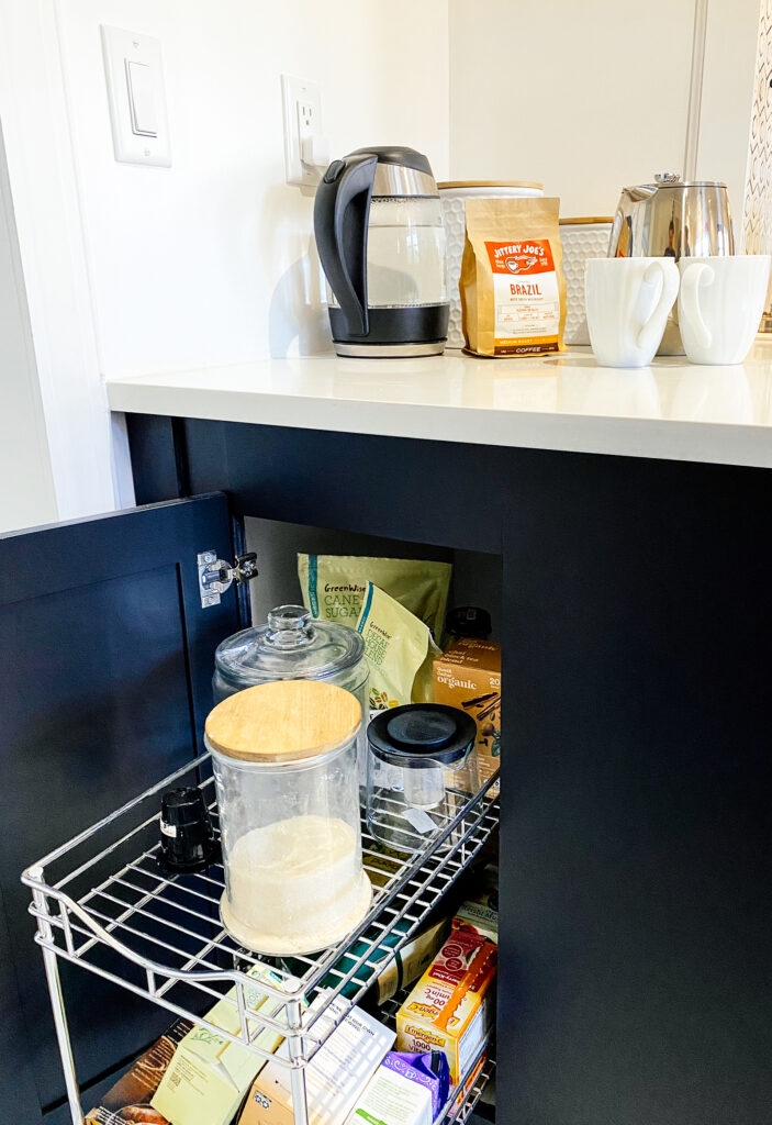
Another pullout shelf below the coffee corner keeps our consumables close by, tidy, and out of the way.
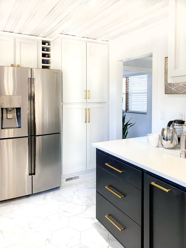
Another MUST HAVE for this redesigned kitchen was a pantry! In what used to be a doorway to the next room, we built a huge floor-to-ceiling pantry to hold all the things. We filled the pantry with pullout shelves for ease of access (another inspiration from the kitchen showroom we visited!).
From this angle, you can see our bar handle pulls in satin gold. We used two sizes: 5″ wide for the range pullout cabinets and the top of the pantry and 8 3/4″ wide for the large drawers and the bottom of the pantry.
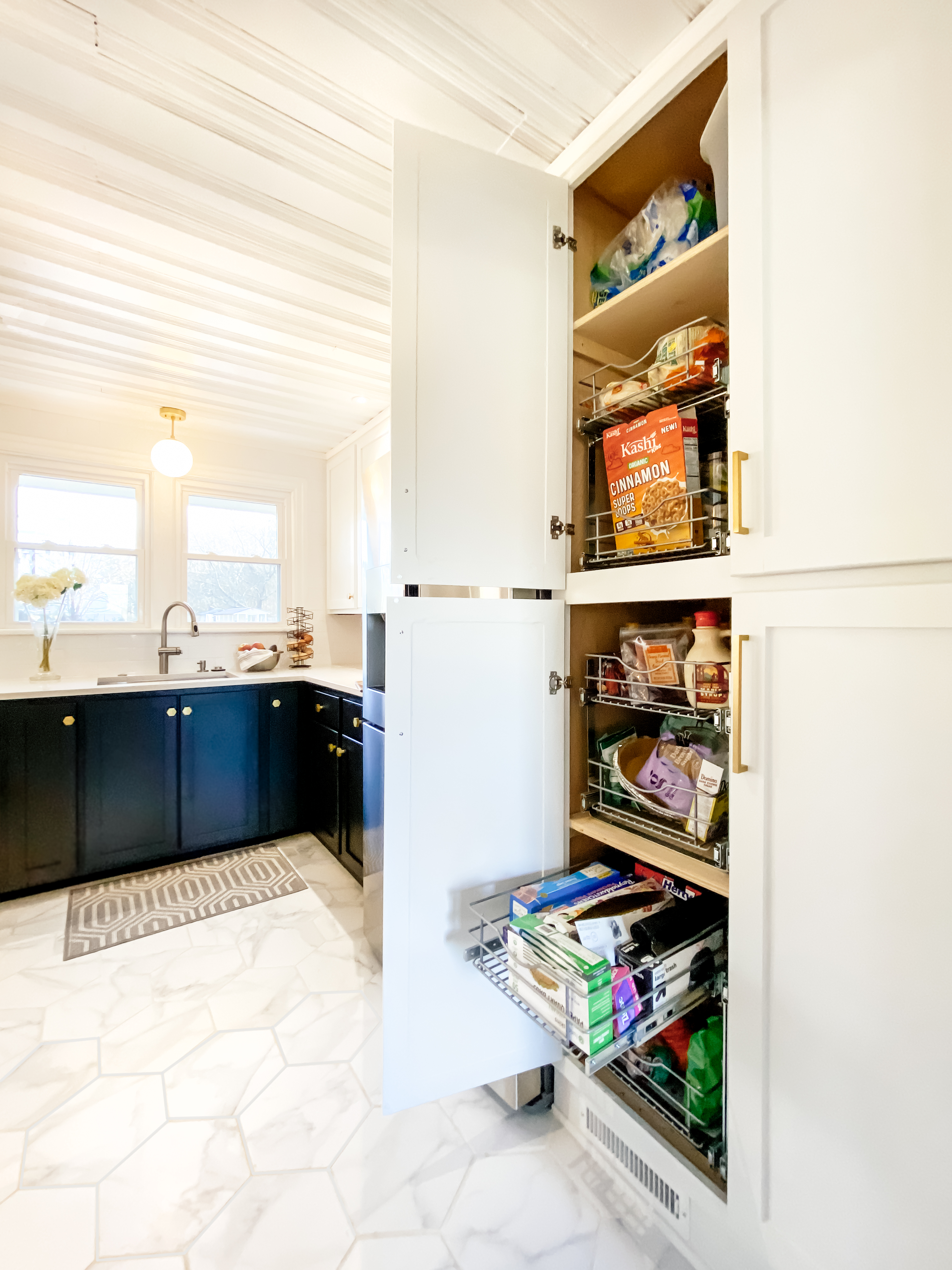
Did we spend hours organizing our shelves before taking these photos? Hahaha! Clearly not!
Total kitchen organization is not realistic – okay, at least not for us! But we can honestly say that we find things much easier with pullouts, as things don’t get lost in the back of the pantry anymore — well worth the investment.
We tried several manufacturers, but finally fell in love with these fully extendable, soft close pullout shelves and used them throughout the kitchen.
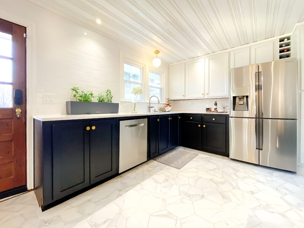
The sink side of the kitchen is comprised of several re-used cabinets in an L-shape. The base cabinets and some of the uppers were built in place during the 1950s, which means they were built to stay put. We worked with what we had and customized where we could. New doors and new paint really modernize them. The left cabinets, next to the door, store our microwave and additional pullout shelving.
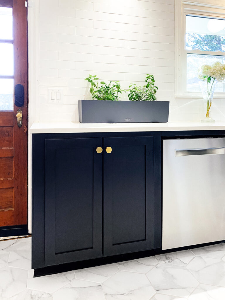
The floors we installed are large-format porcelain hexagon tiles with the look of marble, but without the cost of marble! (Here’s the post where we installed these.)
The wall is covered in white porcelain subway tile that has a unique classic and handmade feel. We also grow kitchen herbs on the countertop for year-round use with the Lechuza Self-Watering Planter (love), ’cause we basically live on basil and pesto!
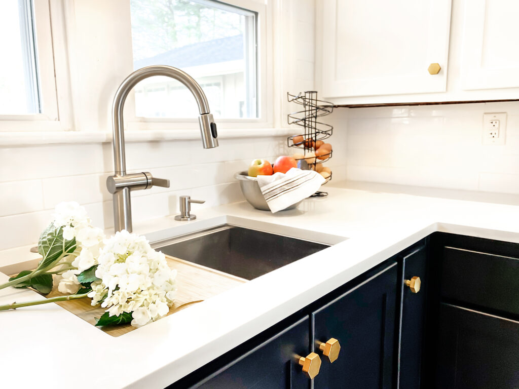
After searching forever for the “perfect” undermount sink made with thick stainless steel, insulated sides and bottom, scratch-resistant surface, and with no dividers (who knew that would be so challenging?!), we found a swoon-worthy one in the Kraus Kore Workstation sink. This sink is ahh-mazing. The lip around the edge of the undermount perfectly holds an integrated bamboo cutting board, a roll-up drying rack, and lots of accessories. If you’ve been in the market for a new sink, you may love this one as much as we do!
The eggs our sweet chickens provide are kept orderly on our spiral, black egg dispenser (no refrigeration needed for fresh eggs!)
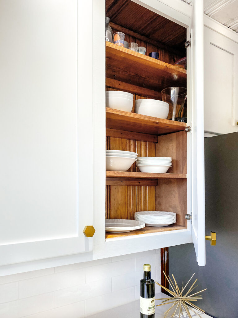
The satin gold hexagon knobs on the cabinets are a tiny bit of luxe in and continue the hex theme in the house.
A peek behind the uppers between the sink and the refrigerator show the “built-in-place” situation with the original cabinets. The old pine wood planks and oak shelves are visible behind the modern exterior. They are super sturdy and we saw no reason to tear them out. They’re ready to last another 70 years!
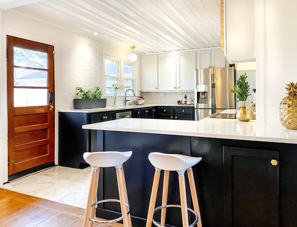
The mockup I drew for the kitchen included a peninsula with bar stool seating, and Chris and I built the cabinets to accommodate this vision. A slight 10″ overhang of the quartz countertops allow more usable space for setting down groceries, gathering, cooking, and eating quick meals together.
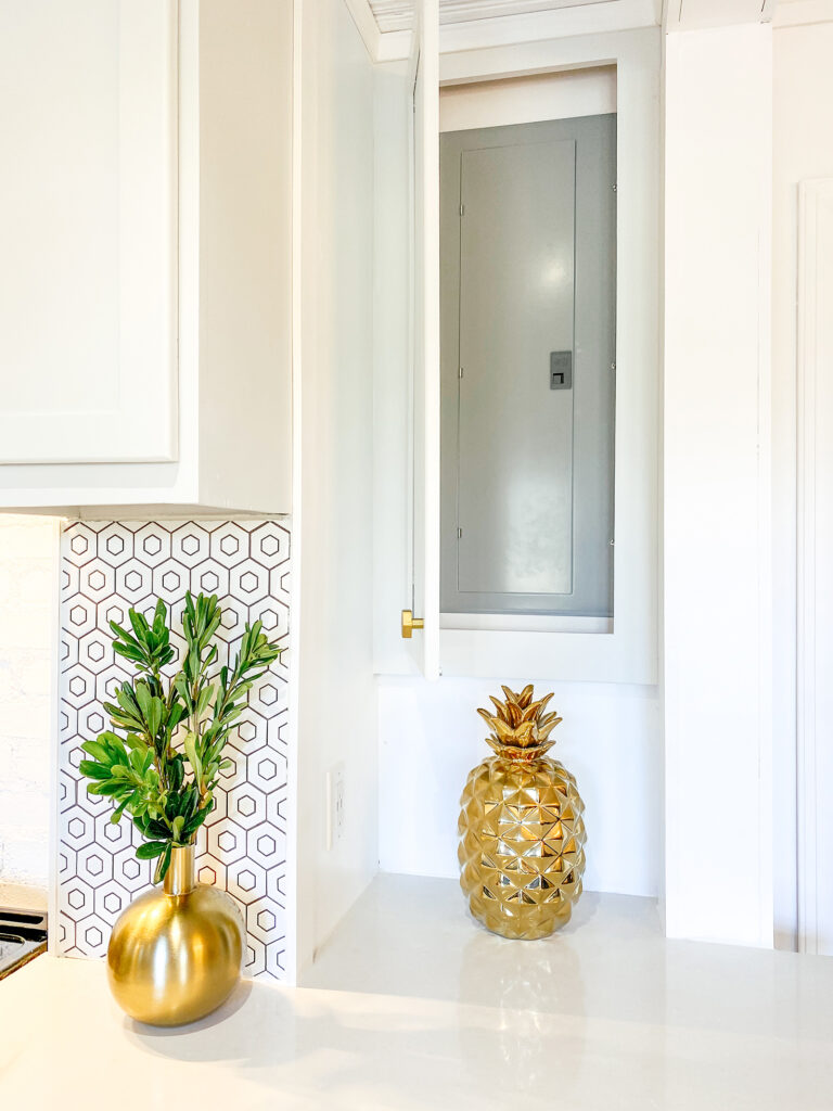
And I don’t want to overlook one of our original nemeses in this remodel — the kitchen electrical panel!! Our electrician/one of our favorite people in the world (Chris) moved the entire panel for us last summer so this renovation could happen in the first place. We then hid the panel behind a cabinet door!
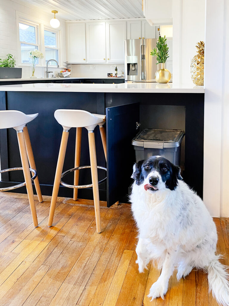
Lastly, when we say this kitchen is built for our family, we mean our ENTIRE family! On the backside of the peninsula, we built a pullout shelf just for the dog food container. Evie clearly approves (Archer does too!).
Colors & Materials
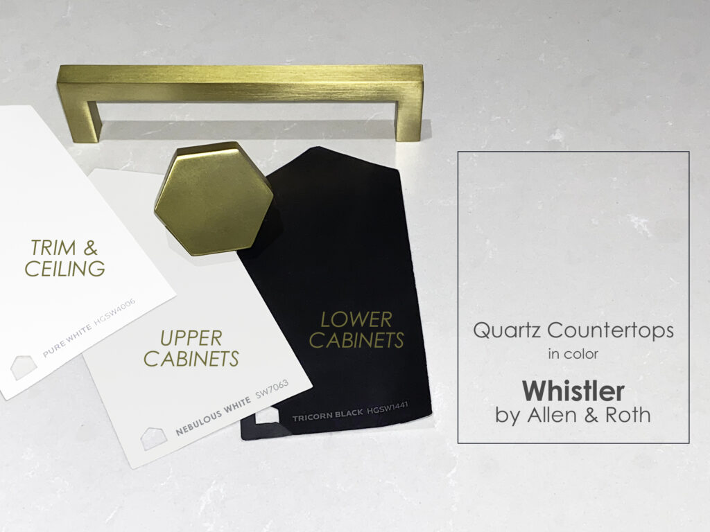
As promised, here’s a run-through of all the things we used in our kitchen and a link if you’re shopping for your own space! Some of these are affiliate links, but most of these are just a helpful list.
- PAINT
- Lower Cabinets: Valspar Cabinet & Furniture Satin Enamel, in the color Tricorn Black by Sherwin Williams
- Upper Cabinets: Valspar Cabinet & Furniture Satin Enamel, in the color Nebulous White by Sherwin Williams
- Trim & Ceiling: HGTV HOME by Sherwin-Williams Infinity Satin Tintable Interior Paint in the color Pure White by Sherwin Williams
- CABINET PULLS & HANDLES
- Hexagon Knobs: GlideRite 1-1/2 Inch Solid Hexagon Cabinet Knob in the color Satin Gold
- Bar Handle Pulls (8″): GlideRite 8-3/4 in. Center Solid Square Bar Pulls in the color Satin Gold
- Bar Handle Pulls (5″): GlideRite 5-Pack 5 in. Center Solid Square Bar Pulls in the color Satin Gold
- COUNTERTOPS
- Quartz from Allen+Roth in the color Whistler
- TILE (FLOORS & WALLS)
- Hexagon Backsplash Tile Range: Satori Hudson Brilliant White 12-in x 12-in Matte Porcelain Honeycomb Wall Tile
- Backsplash Subway Tile Around Window/Sink: VillaArtisan Frost Ceramic Tile
- Hexagon Floor Tile: MontalcinoArina Bianco Matte Porcelain Tile
- LIGHTING
- Light Over the Sink: Semi-Flush Globe Ceiling Light in Satin Brass
- Recessed Lights Throughout: Gimbal 3″ Recessed LED Lights
Budget
The kitchen renovation was actually completed on a budget! The biggest budget item were the countertops (HALF of the budget), but we were able to save thousands of dollars building most everything else ourselves. Here’s an estimated budget for the entire kitchen.
- Floors – $800
- Countertops – $4000
- Cabinets – $800 in construction of cabinets, paint, soft-close drawer slides
- Backsplash tile (subway and small hex) – $400
- Trim – $200
- Hood vent – $500 in hood vent and ash wood surround
- Pullout baskets for pantry and cabinets – $600
- Sink and Faucet – $500
- Pulls and Handles – $200
- Lighting – $100
Total: $ 8,100
From estimates we’ve gotten, we saved a minimum of $15,000 – $18,000 by building the cabinets and doing all the other work ourselves!!!
Cabinets
We have so many photos of how we built, installed, and painted the pullout cabinets, base cabinets, and wall cabinets and doors, we’re going to share a separate post on just that. We couldn’t believe how straightforward they are to build and couldn’t believe how much money we could save just by DIY’ing them. Much more on this to come!
Quick Looks Before & After
View Into Kitchen from Dining
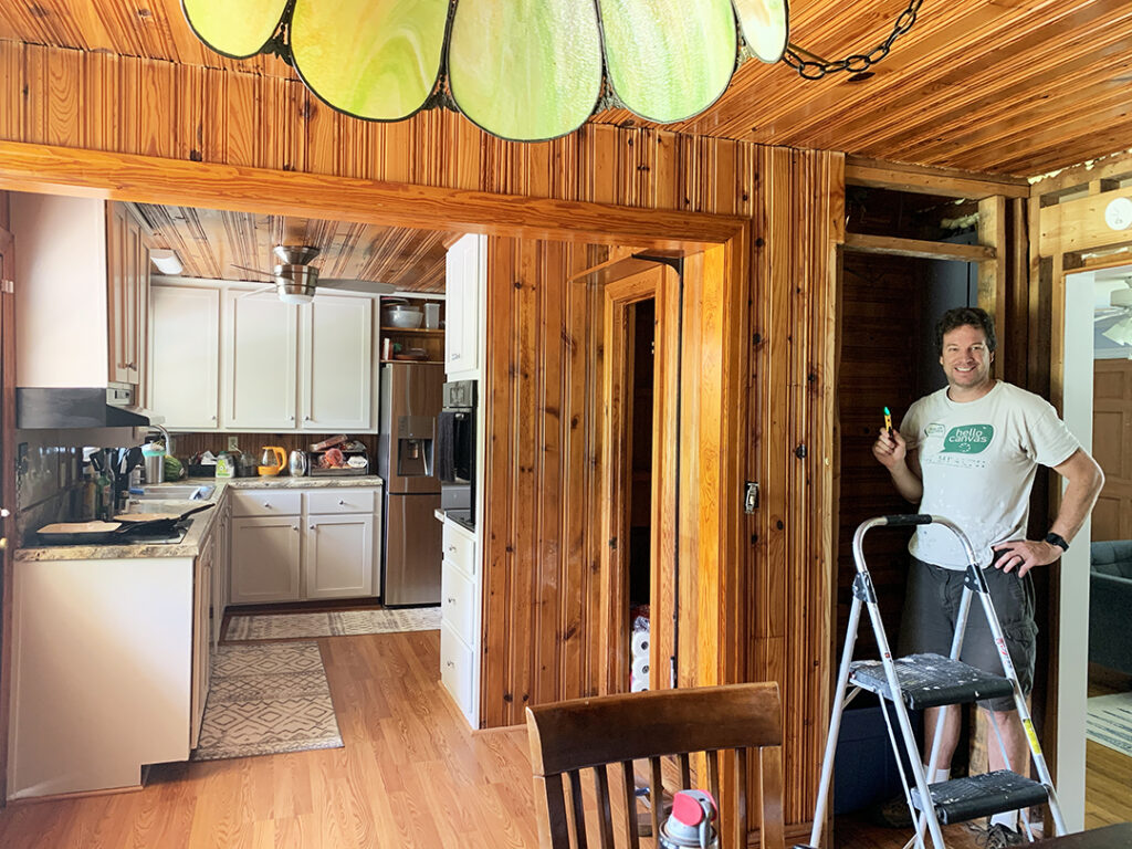
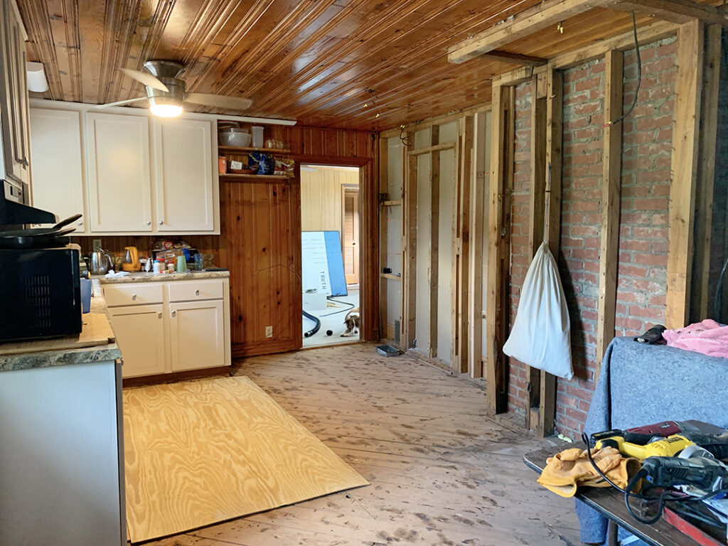

View Towards Brick
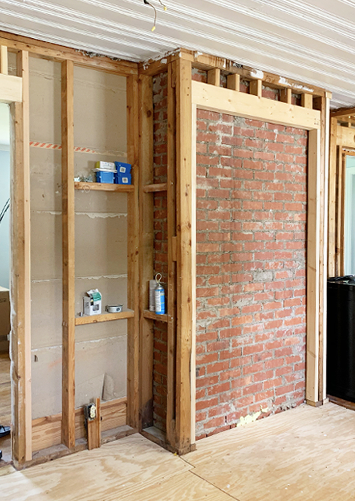

View Towards Future Pantry
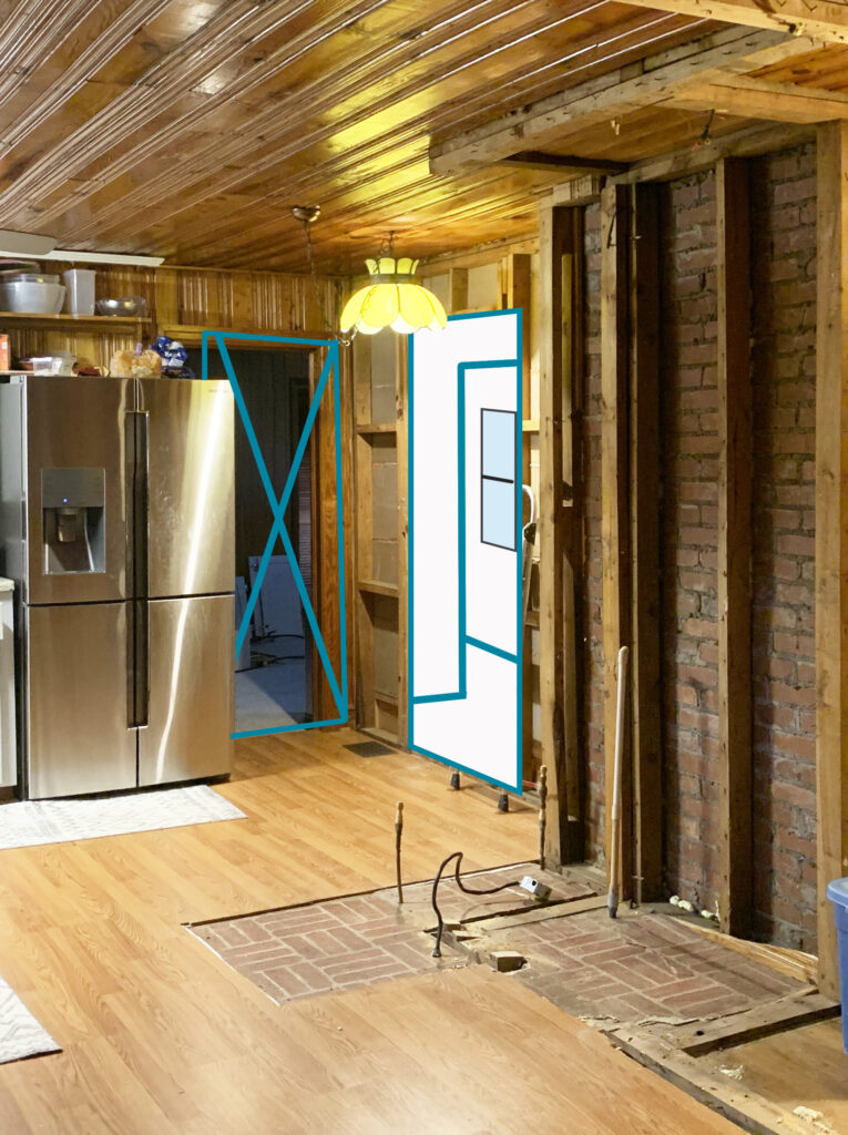

View Towards Windows
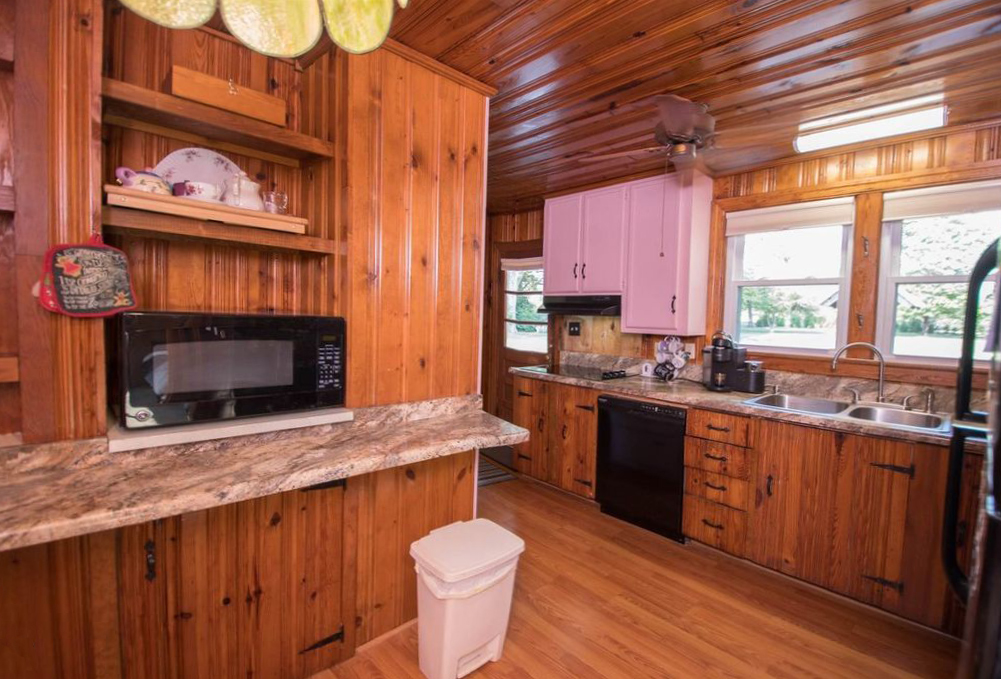
We hope you enjoyed this look through our newly renovated midcentury kitchen. We tried our best to strike a balance between honoring the old/incorporating the new, using what we had/building what was out of our budget, and making it livable/adding touches of luxury.
Add your comments and questions in the chat below!
Your midcentury kitchen is gorgeous. I stumbled across your blog while researching cabinet paint products. My husband and I are redoing our little place in Virginia and I am just about ready to start painting the old oak cabinets. I’m wondering if you used a primer and if you rolled or sprayed. this house doesn’t have any workspace available for spraying and I’m really nervous about rolling cabinets. Just wondering if you can give a little more info on your process. Thanks and I look forward to more posts!
Thx
D